|
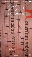
Contrary to how this looks, I don’t think I actually hate blackletter. In fact, that type of lettering is featured as the background of my phone, and I’ve been known to swoon at my fair share of illuminated manuscripts – all of which feature this lettering. But I think that’s the difference. I like it as lettering – not type, which is a big difference for me. When looking at system fonts on Microsoft Word, I’m looking primarily for body copy – something that blackletter used to be used for, but since the invention of the printing press and moveable type no longer feels appropriate. So what I’m really reacting to is the occasion and ways in which this could possibly be deployed – and within Word that feels not only wrong, but in some way irresponsible.
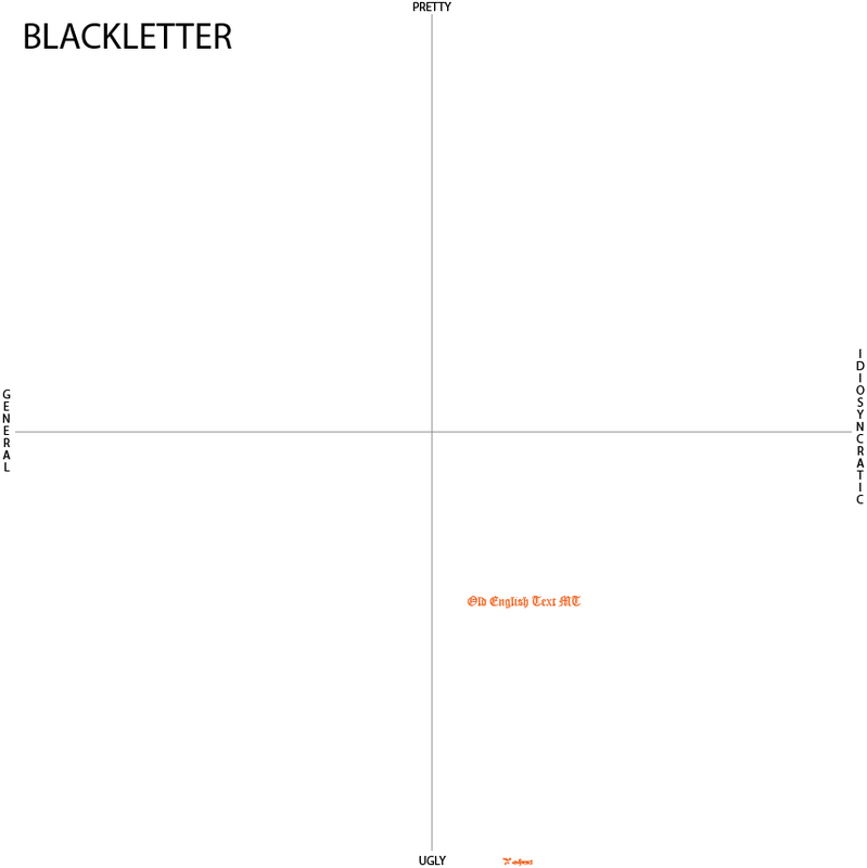
But even within that lens of thinking, I responded to the two blackletter typefaces in different ways. Old English Text is much more visually appealing to my eye than Parchment is. And that has to do with the letters’ distinct elements. Old English Text is bold and big – much like it was designed to be a heading or on the manuscript that is displayed on my phone. While parchment is willowy – squished together without much breathing room between letters. Parchment doesn’t command the authority that Old English Text does and feels like a weaker type choice because of it. |
|
