As with blackletter, I don’t categorically hate decorative fonts either. In fact, in my History of the Book class I focused my final project on decorated type and how it came into being. And I genuinely appreciate type that deviates from the norm. But the same criticism applies here as well. In Word I’m not looking for a deviation from the norm – I’m looking to write a paper.
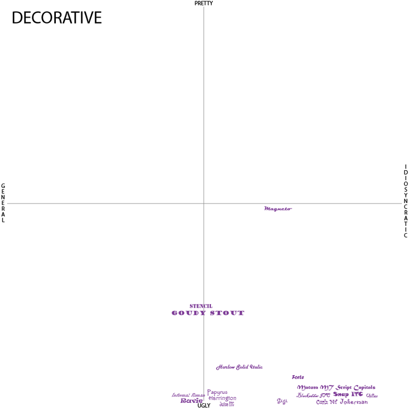
What’s interesting with my placement though, is that the typefaces that demand more authority because they are bigger and bolder (looking at you Magneto, Stencil, and Goudy Stout) are closer to pretty than ugly on my scale. None of the thinner, more willowy, types make it much further than the ugliest of ugly.
But not all bold typefaces made the cut. Ravie, Matura MT Script Capitals, and Snap ITC all rank fairly ugly on my scale. They don’t suffer from willowy syndrome, but one thing they all have in common is that they’re incredibly exaggerated in their stylistic elements. Ravie’s curls and irregular serifs, Matura’s extended limp arms, and Snap’s bulbous body with tiny irregular serifs all feel like overcompensation. They’re relying on their irregularities to draw attention, and to my eyes it feels like they’re trying just a little too hard.
Magneto, Stencil, and Goudy Stout are far from perfect, but the way each letter relates to another in these typefaces make intuitive sense. Goudy Stout, recognizing how its boldness might get overwhelming, spaced the letters out and the thick to thin lines follow a consistent intuitive pattern. Stencil doesn’t attempt to do much more than replicate the form that inspired it. And Mageneto strictly adheres to its own small x-height (how tall each lowercase letter is).
So when it comes to decorative fonts, I can appreciate deviation, but only when the letters still follow an internal logic – or regular structure. And if it’s bold while also being understated, all the better.
