In 8th grade I made typographic choices. I was a much more carefree version of myself then, but this was also a time when I was experimenting with social regulations and trying to understand how people would react to the things I wore or said. In 6th grade this meant wearing Capri pants, brightly colored toe-socks, and flip flops, and being the only girl to come to school early and play basketball at the basket across from the boys. When I noticed that my friends compliments of ‘that’s so brave, I could never wear that,’ to my capri, toe-sock, flip flop combo weren't true praises, but social cues, I toned down. In 7th grade I began curling my hair and sported more polos ala Abercrombie and Hollister, and in 8th grade I fell somewhere magically in the middle. 8th grade is primarily where these quotes come from. I share all this because I can’t help but see a connection.
Eight years later I've brought them out again in order to see what they could tell me about my previous self. I wanted to understand why I made the choices that I made then so I can understand why I make different choices now.
In order to do so, I looked primarily for patterns. I used a variety of fonts, but there were a few that I used for several different quotes which I took as an indication that I really liked that font. Using those fonts as case studies, I realized that I was making associations of gender from the shape, weight, and color of the typefaces. This often correlated with the language of the quote itself. The quotes that discussed love or somehow indicated a romantic relationship or attraction were typed in a soft sans serif, or a script that is often associated with the feminine. Whereas quotes that did not have a feminine theme took form in general default sans serifs and serifs. Throughout the examples below I refer to the more feminine fonts as 'girly' or 'willowy' to describe the way that a typeface looks, but also the feeling I get from it, which indicates that these font choices weren't random decisions. Rather, I was tapping into previously known stereotypes.
This section is broken up into three categories: sans serif, serif, and script. In each category there are two to four fonts examined with the images of the quote and font just above the analysis for reference.
SANS SERIF
CENTURY GOTHIC
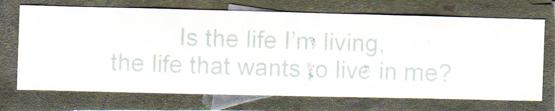
I used Century Gothic for a wide variety of different quotes, which makes sense considering that the typeface itself doesn't necessarily telegraph a strong tone. Its consistent weight and focus on perfectly round shapes makes it able to switch from topic to topic and still feel relevant.
But at the same time, there are subtleties that signal the feminine. In the purple quote for example, the question mark deviates from our standard understanding of the form by curving at the bottom rather than forming a straight line. Curves are associated with women because women's bodies are known to exhibit them with boobs, wider hips, and a pregnant belly. The curve of the question mark is enough to transform a relatively neutral typeface into one that is slightly feminine.
But at the same time, there are subtleties that signal the feminine. In the purple quote for example, the question mark deviates from our standard understanding of the form by curving at the bottom rather than forming a straight line. Curves are associated with women because women's bodies are known to exhibit them with boobs, wider hips, and a pregnant belly. The curve of the question mark is enough to transform a relatively neutral typeface into one that is slightly feminine.
ERAS LIGHT
Eras Light doesn't have the balance that Century Gothic brings because the weight is so much thinner. In these quotes specifically, several of the letters seem to be fading away or parts of each letter seem to have not been printed in the first place. This is most evident with the a's.
This quote also exhibits femininity, but in a different way then the example above. The thinness of the type makes me think of the ideal of feminine beauty. As is often the case in real life, this font has seemingly gone too far, and instead of beautiful, it looks more frail, or weak. Not decrepit, but willowy - as though it lacks substance. These associations bring up other stereotypes of women: that they're not as strong as men, and they lack substance or aren't capable of intellect.
Considering this is what I'm reading into them, it feels important that the first quote is spoken by a female - who in the movie is very thin, sort of spacey, and blonde.
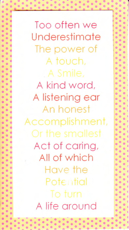
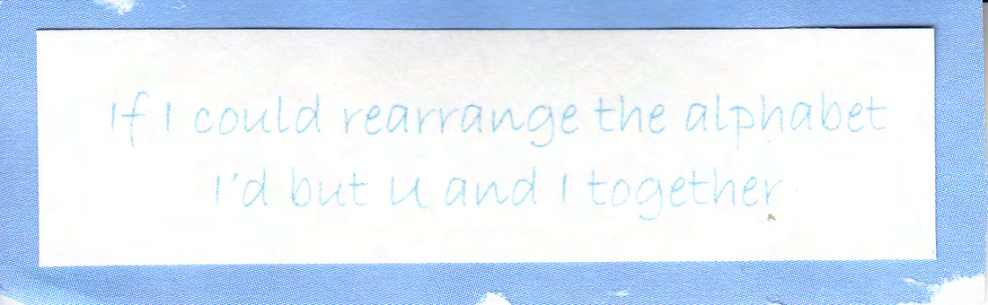
MAIANDRA
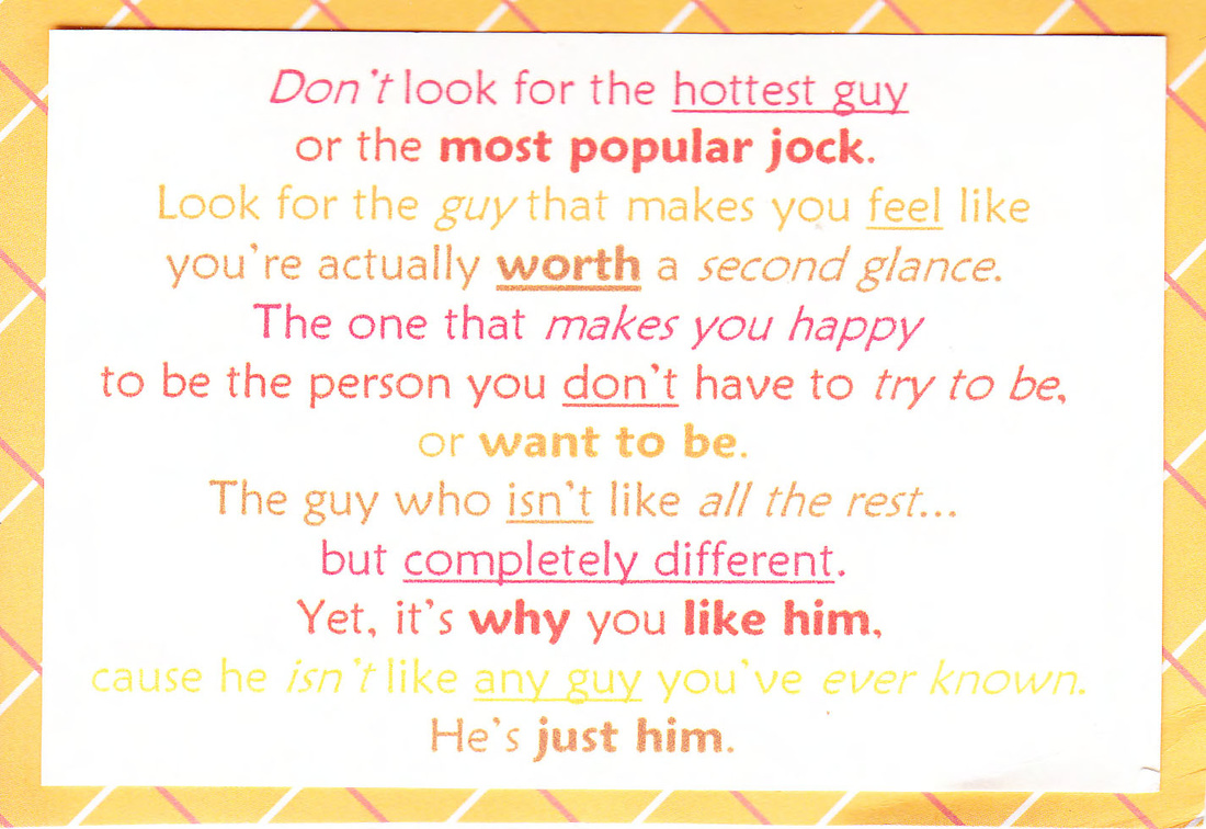
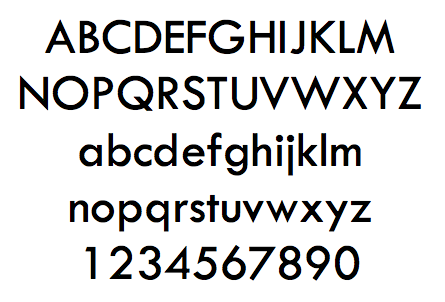
This typeface is about as thin as Century Gothic and has a similar consistent weight, but each end point (or terminal) of a letter curves into a ball, which softens the typeface. Think of the difference between a newly sharpened pencil and one that has been dulled from use. TW Cen MT is a good example of a 'sharpened pencil' typeface compared to the dullness of Maiandra's terminals. Softness is associated with femininity in a similar way that weakness and frailty is. Much like weakness is the opposite of strength, softness is the opposite of hardness, which reasserts a masculine v. feminine dichotomy.
The more bulbous terminals also feel more playful and childish, like bouncy balls and bubbles. I personally get flashbacks to kindergarten when I went to my friend Cassie's birthday party and as party favors we all got lunch boxes to take home that were decorated with our names. Her mom had written all of our names and then dotted each terminal in an attempt (I assume) to make it look more playful.
The more bulbous terminals also feel more playful and childish, like bouncy balls and bubbles. I personally get flashbacks to kindergarten when I went to my friend Cassie's birthday party and as party favors we all got lunch boxes to take home that were decorated with our names. Her mom had written all of our names and then dotted each terminal in an attempt (I assume) to make it look more playful.
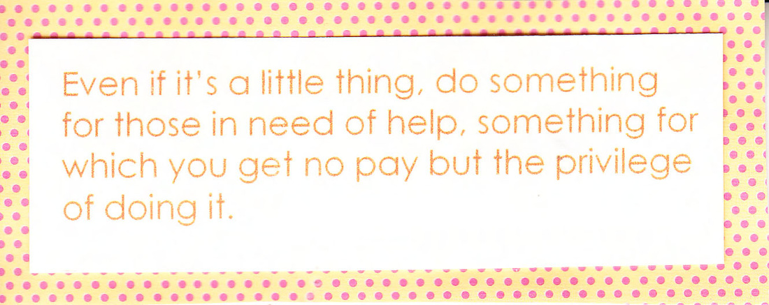
ARIAL
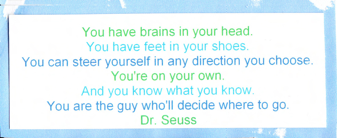
Arial is the most general of all of the sans serifs that I chose. Arial is often referred to as a worse version of Helvetica, which many consider to be the perfect font. With Arial's 'little brother' association accounted for, it is important to notice that Arial itself has a no-nonsense attitude about it, because it's not necessarily curvy, or excessively thin. It gets this attitude from the fact that it doesn't deviate much from what we expect from 'ordinary' letterforms. So much so in fact, Arial is often considered a baseline or default typeface.
All of this is interesting considering the quotes I chose to pair it with. Nothing about these quotes on the surface is the least bit feminine. In fact, the Dr. Seuss quote specifically indicates that he's speaking to a male audience. In addition, the colors I chose to accompany these quotes are quite different than the earlier examples. Each of the typefaces above were featured with some sort of pink, orange, or yellow, but these are all greys, blues, and greens. I paired these more masculine colors with a default font, and gender-neutral quotes. This seems to suggest that the male experience is the norm, while things that are more feminine mark themselves as so. There's an absence of feminine typography here because there's a lack of feminine voices in the quotes.
All of this is interesting considering the quotes I chose to pair it with. Nothing about these quotes on the surface is the least bit feminine. In fact, the Dr. Seuss quote specifically indicates that he's speaking to a male audience. In addition, the colors I chose to accompany these quotes are quite different than the earlier examples. Each of the typefaces above were featured with some sort of pink, orange, or yellow, but these are all greys, blues, and greens. I paired these more masculine colors with a default font, and gender-neutral quotes. This seems to suggest that the male experience is the norm, while things that are more feminine mark themselves as so. There's an absence of feminine typography here because there's a lack of feminine voices in the quotes.
SERIFS
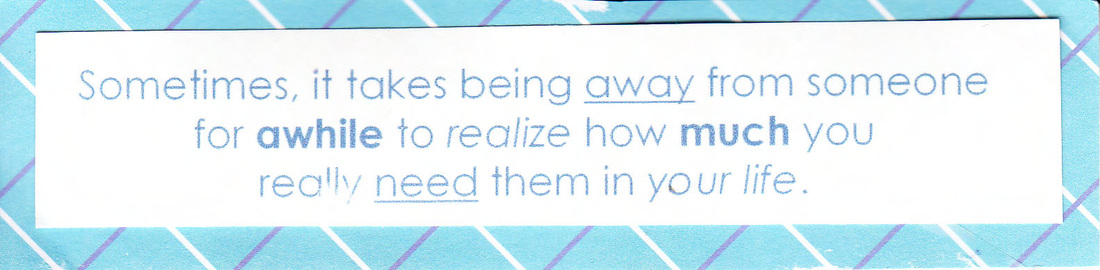
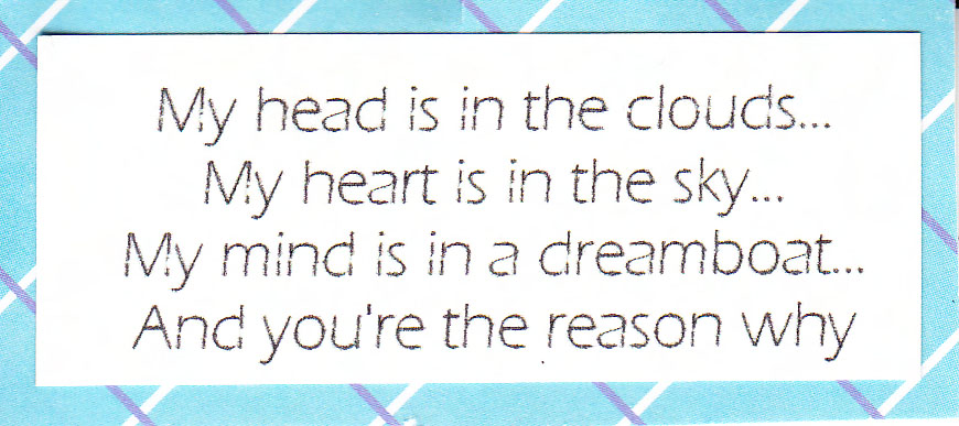
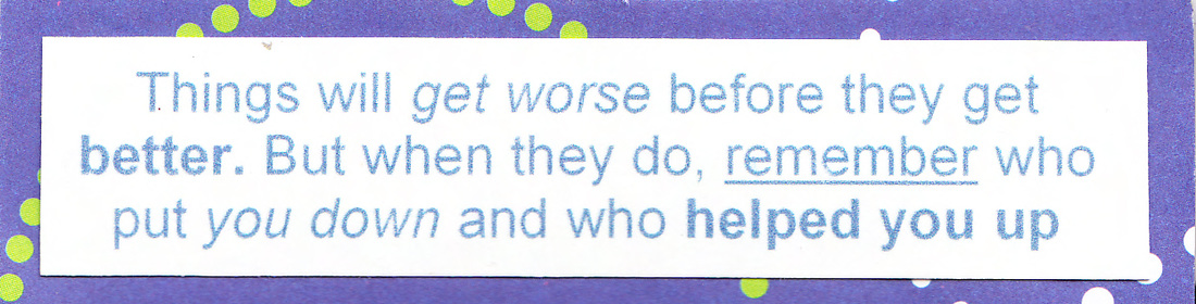
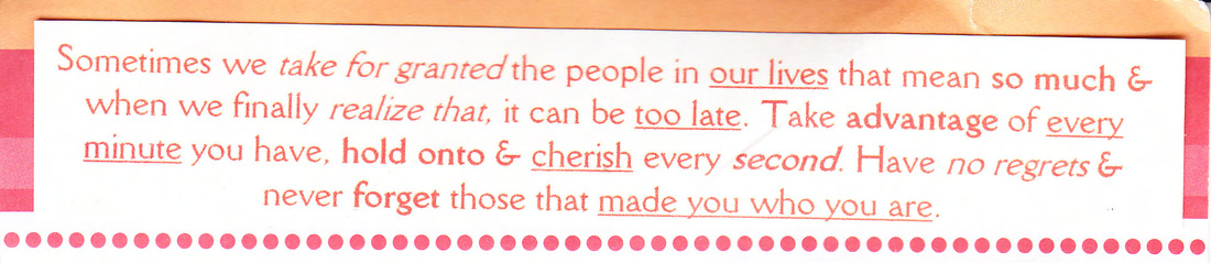
COURIER NEW
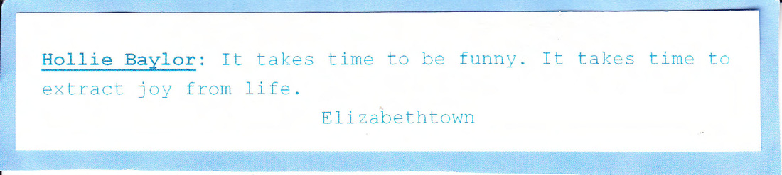
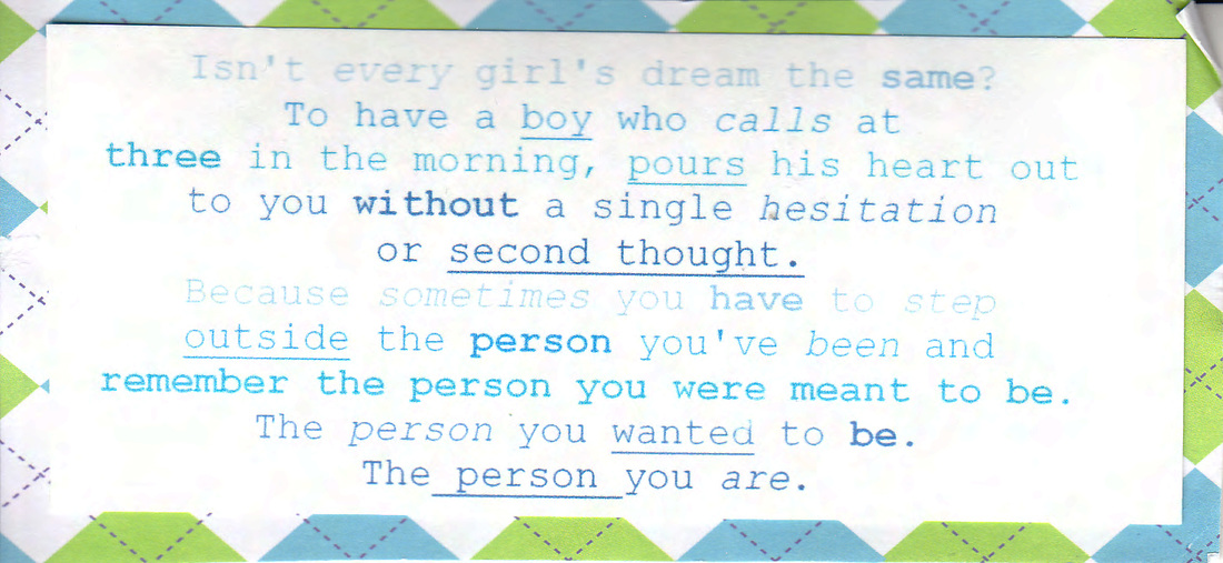
Courier New features a light stroke weight with serifs. It also has a lot of space between each letter unlike the other serifs that I chose. This space is a reference to its history. Courier was a typeface originally designed for typewriters. Because typewriters could only move the same amount of space forward or backward, monospaced typefaces such as Courier were created so that each letter took up the same amount of horizontal space. Because of this history, this font has a lot of nostalgic value.
I didn't know all of the history behind Courier New in 8th grade. All I had was the fact that it was a light stroke weight with serifs with a lot of space between each letter. What's interesting is that even though it's a more stylized serif, the quotes are similar to the quotes that I picked for Arial and my color choices are similar as well. It couldn't be the lighter stroke weight, because that was associated with femininity in the sans serifs, so perhaps what I'm responding to are the serifs themselves. Serifs quite literally ground each letter to the invisible line it lies on top of. This grounding has associations with the masculine ideal of stoicism and stability.
While these quotes are spoken by female voices, the content of the quotes are platitudes that could be associated with either gender. Even the quote that starts "every girl's dream" ends with a call to be who you are.
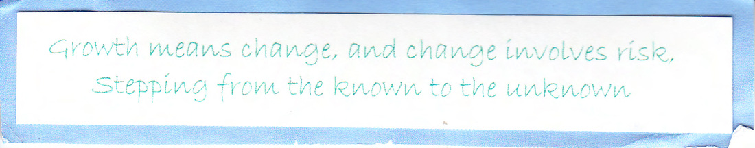
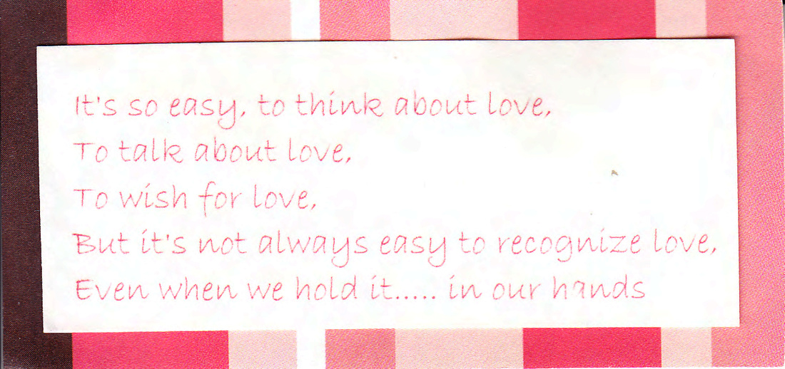
CENTAUR
Centaur features stylistic variance from a more general serif like Times New Roman by the slight slant in the weights of the letters. This is seen most clearly in the e and in the a. Some letters such as the j also show indications of a font inspired by engraving.
There's something about this font that looks just a little bit off. Like I mentioned above, I associate serifs with stability, but the upturned e and the italicized a are literally unstable, not consistent with the rest of the typeface. This typography gives the quote a quirkiness that isn't exhibited by other serifs. I corroborated that sentiment with reds and purples, more stereotypically feminine colors.
Much like in Century Gothic, the question mark expresses a lot for this font. It starts strong, but gets skinnier and skinnier, and starts to fade away - consistent with the willowy judgment I made of Eras Light. Those few aspects seem to take away from the authority that it would normally have as a serif, and makes it feel more feminine.
SCRIPT
BRADLEY HAND
Bradley Hand is an informal script, and feels stereotypically girly, but in a well defined and consistent way. Bradley Hand plays off of the feel of cursive, but doesn’t actually go through with it by connecting those letters together.
The automatic association with girly goes back to elementary school for me. There was a weird phenomenon where all of the popular girls had the exact same handwriting, and it looked an awful lot like this. In fourth grade, my handwriting didn't fit this mold. It was small and irregular, but as I had to take notes more quickly I merged the version of cursive I was taught in third grade with my small, irregular letters and ended up with the sloppy, curvy, sometimes indecipherable letters that make up the titles of this website.
Whenever script is used it's frequently used in regards to women or love. While there is personal experience behind it, this association feels incredibly socialized.
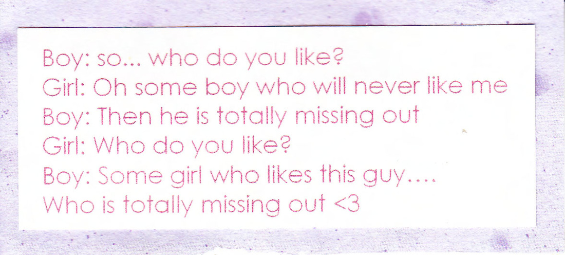
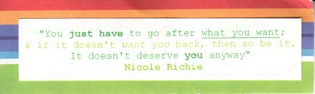
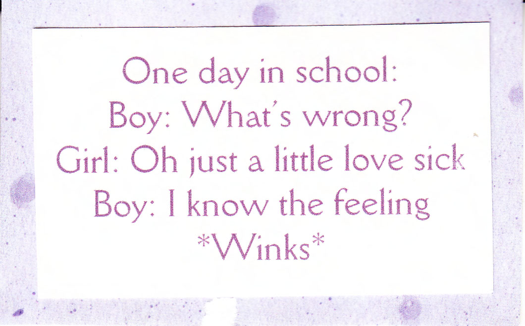
SCRIPT MT BOLD
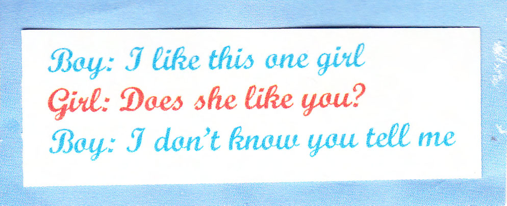
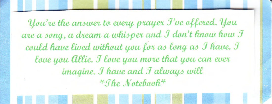
Script MT Bold is also an informal script. It is distinctly curly in a way that looks like the cursive that we are taught in third grade, with a thicker stroke weight. Much like Bradley Hand, it says girly in a very stereotypical way. And the quotes follow suit, one focusing on a boy, girl interaction and the other as a quote from the Notebook.
The color choices however are initially confusing. If the font and the quotes are sterotypically feminine, why don't I choose more feminine colors? The first quote, upon further inspection makes sense. Alternating blue for the boy and red for the girl follow gender norms. The Notebook quote (which I would expect to be in a shade of pink considering the Notebook is a cliche for romantic movies and the movie case itself is pink) is uncharacteristically green. However it is less odd after realizing that the speaker of the quote is Noah - the male lead of the movie and Nicholas Sparks novel. My choice of green can be interpreted as my way of acknowledging the male speaker, while still capturing the femininity that the movie exudes.
The color choices however are initially confusing. If the font and the quotes are sterotypically feminine, why don't I choose more feminine colors? The first quote, upon further inspection makes sense. Alternating blue for the boy and red for the girl follow gender norms. The Notebook quote (which I would expect to be in a shade of pink considering the Notebook is a cliche for romantic movies and the movie case itself is pink) is uncharacteristically green. However it is less odd after realizing that the speaker of the quote is Noah - the male lead of the movie and Nicholas Sparks novel. My choice of green can be interpreted as my way of acknowledging the male speaker, while still capturing the femininity that the movie exudes.
SUBSEQUENT THOUGHTS
At the time these quotes felt like the ultimate self-expression, but really it was just me playing matchmaker: the perfect font for the perfect quote. There weren’t explicit rules or guidelines I was following while doing this, except the distinct feeling that the match felt right.
Or that’s what I thought. Looking back through them eight years later it’s impossible not to see these quotes as incredibly gendered. And the font choices, for the most part, follow suit. What’s clearest to me now is that when I was making these choices eight years ago, without the knowledge of power, privilege, and systems of oppression I associated passive, feminine, quotes with more curvy and thin typefaces without giving it much thought.
So when I read a bulbous and curvy typefaces as ‘girly’, like I do above, I’m associating that with a constructed femininity. I do the same when I call a thin typeface willowy. All of this has become wrapped into these ‘gut feelings’ I have when I encounter these typefaces. At this time, social construction of gender was integral in forming my aesthetic.
