It must have always been there, this appreciation for the way language looks because when my first great teacher typed up a cliché story I wrote about a princess version of my and my best friend Max’s marriage in comic sans I liked it and declared it as my favorite font for the next four years. Comic sans has gotten bad rap these days, but it’s consistently soft weight and subtle imperfections delighted my six-year-old eyes, and felt like me.
It was years before I would learn my ignorance, that comic sans could not be the favorite font of a self-respecting lover of typography, but it was also years before I realized that these fonts that showed up in Microsoft Word were created by someone as the result of many specific minute decisions intended to solve different problems, and utilized for different moods. Just askVincent Connare, creator of comic sans. Like most little Americans growing up in the late 90s, early 2000s, I grew up with choices without realizing why, and delighted in them specifically because they were choices. And at that time, even though I couldn't yet articulate how or why, comic sans felt the most like me.
Years later as a seventh grader flirting with the idea of the aim (aol instant messenger) account that I wasn’t allowed to have, I spent most of my free time on iconator.com, which unfortunately now defunct is described by urban dictionary as:
The most popular icon, avatar, wallpaper, and away message website for preteen and teenage girls. It features an Icon, Avatar, and Wallpaper of The Day, occasional themed contests, and lots of dramatic users, making it just as excitingly stupid as Middle School.
There were pages upon pages of small half inch by half inch squares animated with melodramatic, but oh so real, quotes about friends and boys and middle school. And it a similar way to comic sans these little squares resonated with me. With no aim account to utilize the icons with, I instead spent hours copy and pasting these squares into a word document, carefully curating a library of beauty. And they were beautiful; with often bright optimistic colors, and standard pixelated type it wasn’t just the words that I was responding to, it was all of it.
At this time, my love for language as image was just beginning, but my love for language as language had always been strong. I ransacked the libraries taking home books three at a time, making sure to take note of the passages that I connected to, each time typing them up on a word document to revisit later. Soon, my craving for language surpassed my reading speed and I found myself back on the internet googling quotes and adding them to a word doc. In a transition from middle school to high school I decided I needed them on my bedroom wall. It was clear that with the transition from screen to page, the default Times New Roman that they were in simply wouldn't do. So I went through the selection of fonts I was given in Word like a treasure chest making decisions about which font fit which quote. While relatively diverse in my overall selection, a few emerged as repeats: Eras Light, Century Gothic, Bradley Hand to name a few. I had outgrown Comic Sans - Eras Light and its sleek thin lines swooping in to take its place. And looking at my selection, there’s a clear preference for either script fonts, or slightly stylized sans serifs and serifs with rounded features that are soft on the eyes. The thin lines of Eras Light became more attractive to my 13-year-old eyes than the bubbly playfulness of comic sans. This change in my aesthetic was not something I consciously decided, but rather just seemed to happen in the same way I can't remember when snap bracelets went out of style, but know that they did.
In high school I joined my school's journalism staff (the Murmur) where the typefaces we did everything with were Myriad Pro and Adobe Garamond Pro, a selection picked way before me but I soon began to love. There was an authority just in their names: Myriad (oh the options!) and Garamond, a name with an initial guttural G that situates itself firmly in your mouth, swiftly preceded by Adobe – the name of the company that powers the current design world. At the same time I was taught that there is a formulaic way to write an effective journalism piece, I was given the tools with which to jump start my typographic education. It was in room 501 where I first learned to classify different typefaces: Myriad Pro = sans serif; Adobe Garamond Pro = serif. And shortly after, I came to learn those classifications meant practically: sans serifs used as headlines and captions and serifs for body copy. There were justifications for all of these: serifs were easier to read in large chunks and by contrast the sans serif work well to break that up by presenting something different, something a little softer. I churned out pages dictated by our style guide, Myriad Pro Bold for headlines, and Adobe Garamond Pro for body copy, in the same way that I was able to stitch articles together: lede, quote, explanation, quote, explanation. The first time I heard comic sans mocked was also in 501, along with Cooper Black, and Impact – fonts that our advisor had a particular aversion to.
It was there I learned the word typography, and just having the words: typography, serif, sans serif fueled a desire in me to further understand letters in this way. I went to a journalism conference my junior year where a whole session was focused on typography. One of the presenters identified himself as a typophile and showed us how type could revolutionize the way readers interact with our pages. He had example upon example of type not used specifically for headings but twisted, overlaid, and otherwise manipulated to create a coherent image of its own. Another advisor introduced us to http://www.bemboszoo.com/ and for the first time I saw type come to life as I watched it manipulate itself into the shapes of different animals. It was simultaneously sophisticated and playful, and my heart recognized the impulse immediately. Seeing these bouncing letters I began to realize that while I appreciated Myriad Pro and Adobe Garamond Pro for their internal authority, something I was working very hard cultivate at the time, an emphasis on play felt just as important. Bembo's Zoo offered me a compromise, and unknowingly had also given me a lens through which to better understand myself.
I got a tumblroriginally as a digital archive to store old quotes and a way to acquire new ones, but quickly became fixated on the typography tag. Like on iconator I went on binges searching and carefully curating beautiful quotes/images. I discovered lettering, a set of stylized language for an explicit purpose, built to work together as an image rather than explicitly transmit information. Letters melted into each other, were chalk drawn, made from balloons, knives, matches. They were beautiful representations of self expression that I folded into my sense of self.
In college it became my fun fact. My name is Jamie and I love typography. I had developed such strong internal preferences that the world around me started to shift. I started noticing personalities, collecting letterforms that I liked and discriminating against the ones I didn’t. I developed an eye for spacing, placement, and pairing. Because of this, cringe-worthy design choices were now seemingly everywhere. I internalized these observations as giving me superiority over others, constantly telling myself that I could design better than most of the advertisements out there. This idea was so firm in my self concept that I didn't need to design because having the knowledge of what worked and what didn't was seemingly enough.
In the Winter semester of my sophomore year in college, I stumbled upon the perfect class. Entitled History of the Book, our fearless leader Professor Miles brought us through the beginning of written language: cuneiform through the contemporary kindle. I learned how humans first developed language as a means of recording taxes, but soon began to write down their histories on long scrolls of papyrus, and only several thousands of years later, in the manuscript tradition, did lettering start to become a method of self expression.
Monks were the primary scribes in the 9th-15th centuries, and for them creating a manuscript was a ritualistic process. They would sit for seven hours a day for three months straight creating a manuscript psalter. Like hand lettering, each psalter reflected the monk that made it with individual styles, idiosyncratic spellings and specific illuminations. They were works of art, but also one of the most supreme modes of self expression. Creating psalters for these monk's was a way to pay reverence to their almighty. Only the most beautiful and intricate work would do. Anything less had the potential to damage their esteem as a monk, and their own self concept.
I experienced a similar crisis that spring when I spend six months in the woods of New Hampshire through the New England Literature program (NELP). Becky, my journal group leader, encouraged me to try art and given my appreciation of typography, my first instinct was to render letterforms with the calligraphy marker I brought. I was crushed when they didn't live up to the beautiful letters I had stored on my tumblr. This lack of true experience with the one thing that I truly identified with was embarrassing, and the superiority I had built up crumbled.
The next summer I started from square one. Taking advice from the monks, I printed out an alphabet of Adobe Caslon Pro and traced the letters over and over and over again. But with the close eye on form that I adopted as a wanna-be practitioner, I ceased to remember why I liked the typefaces that I liked.
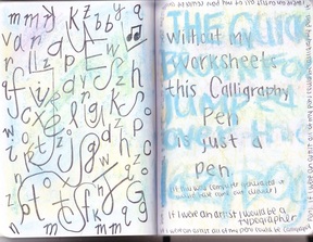
That desire to again understand my immediate associations with different typefaces lead me to write this next section: My 8th Grade Aesthetic. It's another version of starting from square one. By understanding the implicit associations that I was bringing to my matching of font to quote, I'll be better able to understand what I'm reacting to when I choose typefaces now.