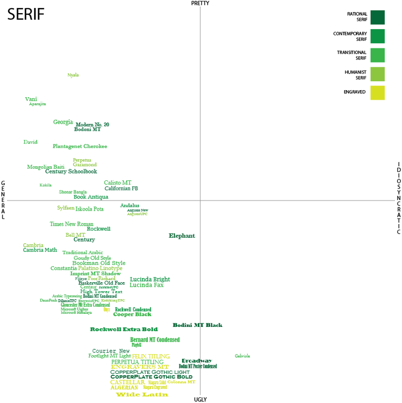
The bold rule doesn’t hold up with serifs, considering most the of the more bold serifs end up in the general-ugly quadrant. But what I found most interesting is that even with dividing the fonts up into more specific categories, my preferences don’t seem strongly to favor one category. I do tend to dislike one more than another though: engraved.
I think the reason for the grudge against engraved has again to do with occasion. Engraved typefaces are modeled after the roman alphabet that was carved into columns and statues – and in a paper I’m not looking to replicate that experience.
The willowy vector seems not to be an issue in this classification either because the serifs ground each letter. Instead I think my brain is responding to the relationship in each typeface between thin and thick lines, as well as general readability.
There is a cluster in the mid general-ugly section where near the bottom all of the typefaces are small, bolder and generally very hard to read. In addition the bolder serifs, Rockwell, Bernard, Bodini Black, and Broadway all feel too strong compared to the others – a similar vector perhaps to the trying-too-hard decorative fonts. But these have a different feeling – more self-involved cocky businessman than the non-self-aware flower child that Ravie is. The boldness in these serifs performs authority in a way that puts me off. They’re bold in a way that doesn’t leave room for the others.
In contrast the typefaces that I chose to be in the pretty-general quadrant are understated and subtle, and my very favorites are ones that I had never heard before. While Times New Roman is a relatively elegant font, its ubiquity makes it less appealing which brings in another vector – familiarity. While Leder argues that familiarity can be a positive in aesthetic experience, in this case familiarity represents staleness. The others, while very similar in style, bring something new and beautiful explicitly because they have yet to be discovered.
