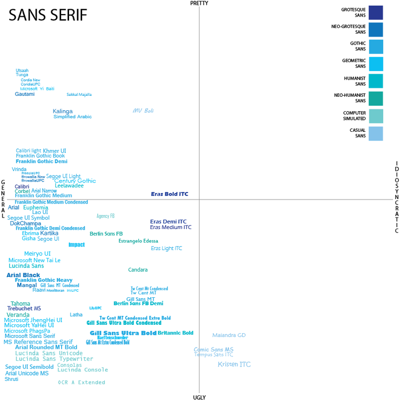
Sans serif was the toughest. In addition to having the most internal categories, I also felt the need to add two – computer simulated and casual since they didn't accurately fit anywhere else. And for the most part, I dislike all of the computer simulated typefaces and most of the casual sans. The reason for the dislike of computer simulated has to do with its reliance on unnaturalness. They were originally a consequence of low resolution and so even with great resolution, they stayed which make them look unsophisticated in relation to all the rest. Whereas the casual sans serifs get the opposite reaction from me - they’re too soft and not crisp enough for the job. I have a problem taking them seriously.
Bold is a detriment in sans serifs as well. Not because they feel too bold or overpowering, but because in that boldness they feel clumsy. Sans serifs are categorically much lighter than serifs and therefore automatically don’t carry the same sort of authority requirements that I bring to serifs. Instead it appears that I’m looking for something lighter, swifter and a typeface that holds itself up in a way that is self-assured, but with a hip-ness.
Bold is a detriment in sans serifs as well. Not because they feel too bold or overpowering, but because in that boldness they feel clumsy. Sans serifs are categorically much lighter than serifs and therefore automatically don’t carry the same sort of authority requirements that I bring to serifs. Instead it appears that I’m looking for something lighter, swifter and a typeface that holds itself up in a way that is self-assured, but with a hip-ness.
