

|
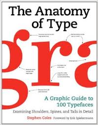
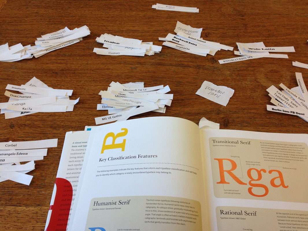
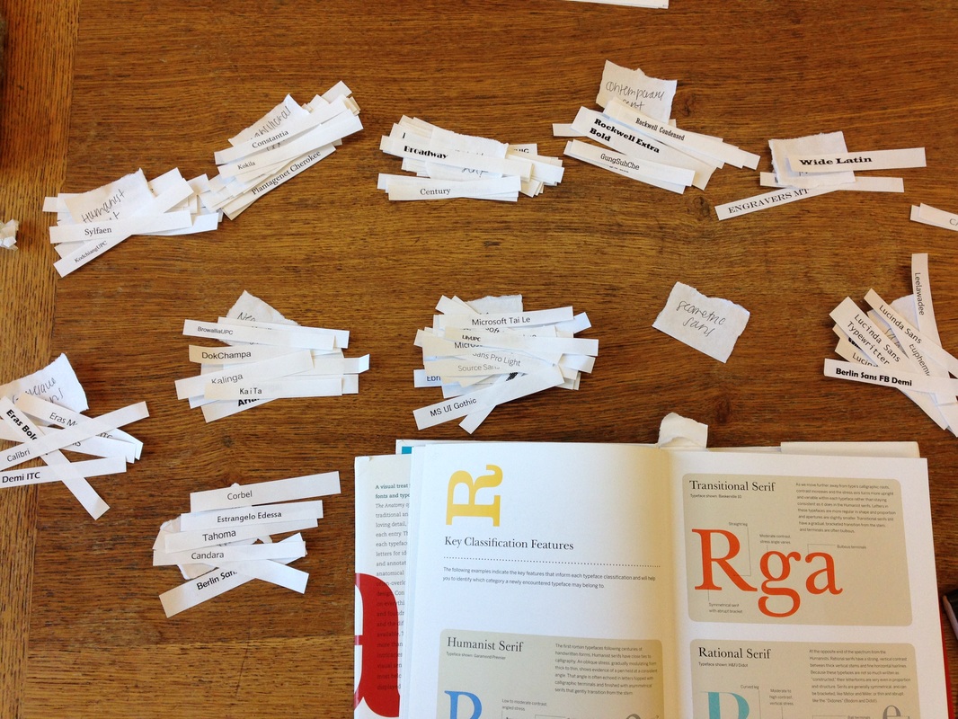
In order to figure out my typographic aesthetic I started with the immediate resources I had: system fonts. I logged onto Microsoft Word on my about-to-implode-any-second-now acer and typed up each one at 18 pt. which resulted in a six page document which I then printed, sliced via paper-cutter, and sorted into the categories that immediately came to mind: serif, sans serif, script, blackletter, and decorative. A few days after that I sat in the Hatcher Graduate library and with a four person table all to myself consulted the bible of this project: The Anatomy of Type: A Graphic Guide to 100 Typefaces to separate the monstrous piles of serifs and sans serifs into more manageable bunches. The book illustrates 4-5 (depending on what you’re willing to consider) serif categories, 6 sans serif categories, 3 slab categories, a script category, and a display. I only got through separating the serifs and sans serifs into approximate categories when the library closed.
|
|
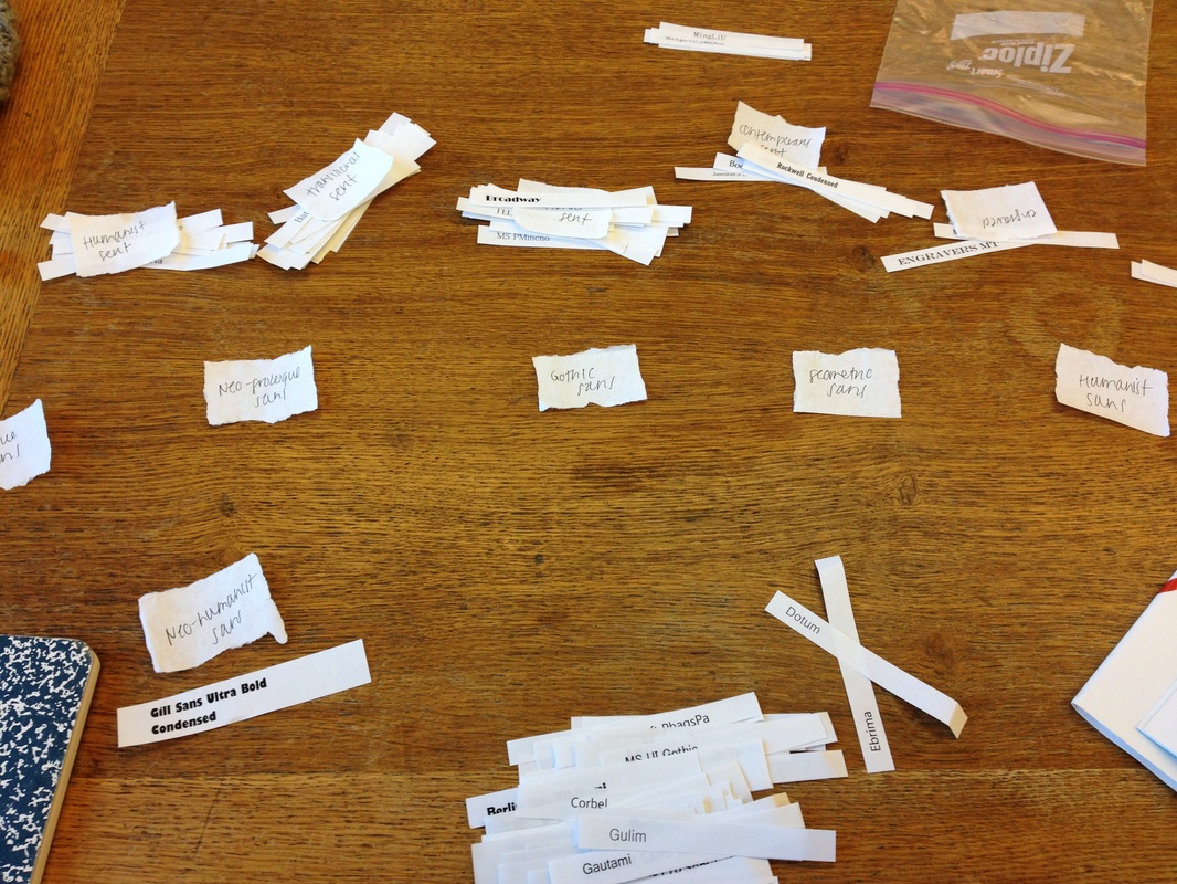
I gathered every paperclip I could, wrapped them up in the scrap I had written the categories on and brought them all back to Alice Lloyd when I realized that this sorting process didn’t need to be me on my knees with little white slips strewn about – I could do it digitally. I logged onto Adobe Illustrator, and started the whole process over again, this time without the book.
|
I started with the graphic on the right and was focused on placing each typeface, simply by my immediate thoughts, somewhere in one of the four quadrants: pretty-general, general- ugly, idiosyncratic-ugly, and pretty-idiosyncratic.
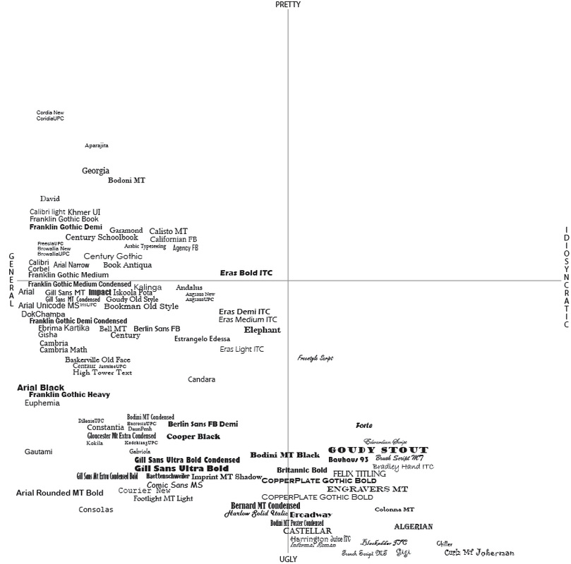
It started out focused and thoughtful: how general is this? What does idiosyncratic mean exactly? But after a while and as the clock ticked into the wee hours of the morning, I was making snap judgments. Because all of the typefaces had to sit on the same plane, each choice I made had to be in relation to all of the other typefaces so I began to evaluate how much more I hated Gill Sans Mt Extra Condensed Bold compared to Cooper Black. They were immediate gut responses. And as is often the case with snap judgments – there were several typeface choices I was tempted to take back. Below is the first draft, without all of the typefaces, of the process above. |
|
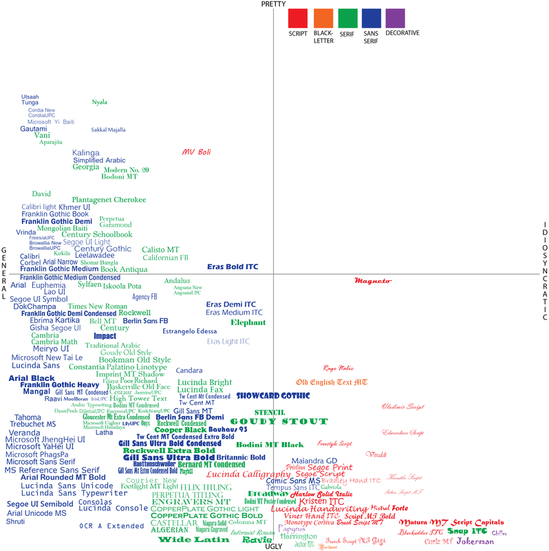
When I had finished putting in all the typefaces I gave myself a day or so to rest and then went back to the grid to organize it more thoroughly. My rationale for organizing was that I knew that near the end I was placing typefaces in places that didn’t feel quite right because there was already a typeface there. With a new set of eyes I was able to better evaluate where I thought the typefaces stood in regards to each other. I noticed that patterns were forming so to facilitate that, I also color coated based on the immediate categories that I could think of, again without the book. Which led to this iteration of the grid:
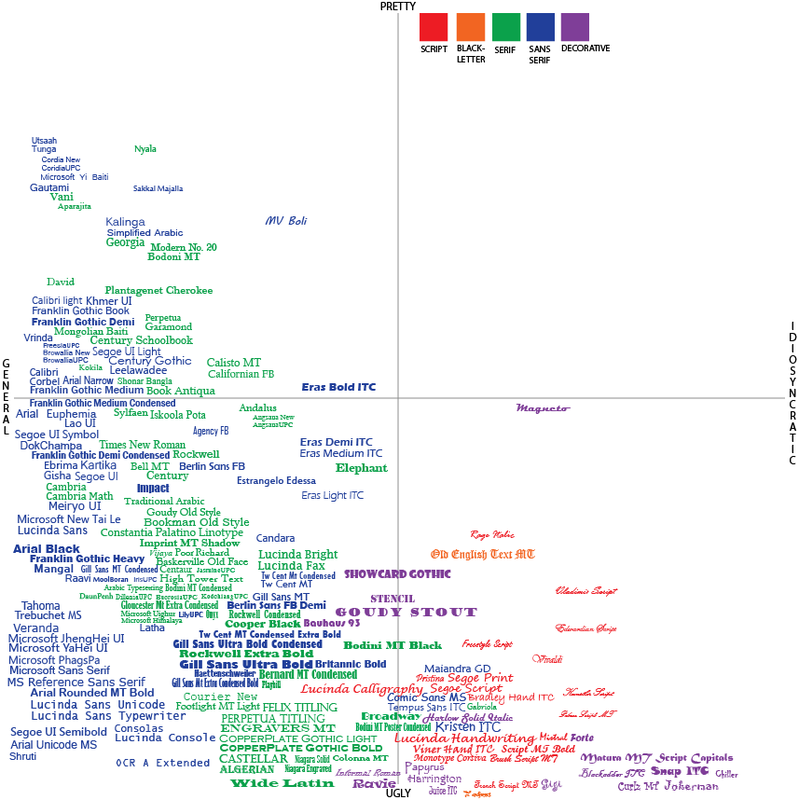
While patterns were beginning to form and I was getting a better sense of what I preferred, the bigger categories (serif and sans-serif) still felt too big for me to get a precise understanding of what why certain typefaces were more appealing to me than others. After a couple of weeks though, some of the typefaces that I had originally sorted no longer seemed to fit. I shuffled some things around, added some categories of my own, and finally came up with this grid as my official baseline through which I would further organize everything else.
I then broke up each of the original five categories into more specific categorizations in order to more thoroughly understand the minute differences between typefaces of the same classification that made me respond differently. Click on the buttons below to see what I learned.

|

|

|

|

|
