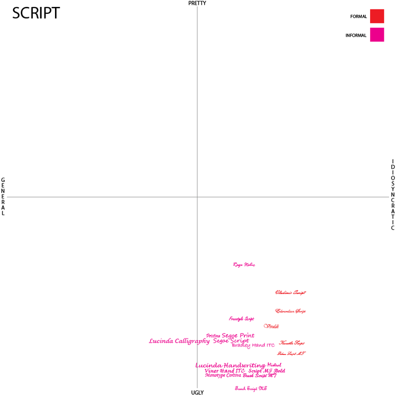
Like Decorative and Blackletter, Script originally was just one category as well, but the more I looked at them the more I realized that some scripts had a completely different feel than others, so I broke them down into formal and informal.
Formal are the cursive you see on wedding initiations. Highly decorated and incredibly thin they give off an aristocratic tone – one of high society. While known to be quite desirable, the reason I found myself putting it in the idiosyncratic-ugly quadrant was that they are excessive. They show too much flourish. I get this impression because while occasionally quite beautiful they are incredibly hard to read.
The informal scripts are those that most closely resemble handwriting, and these have the opposite problem. They’re clumsy in the way that the formal ones are elegant. They are endearing the way a five-year-old is endearing dressing up in her mother’s high heels. But they don’t quite fit. They’re cute, maybe, but not quite right.
My script classification surprised me a tad bit, because if you look at my tumblr, I really appreciate scripts and their occasional flourishes. So the reason that they all end up in the idiosyncratic-ugly quadrant is a mixture of the occasion (please don’t write a paper in a script font) and the familiarity. Most of these scripts have been used far too often for situations that they probably shouldn't have. Because of that many of these are instantly recognizable and once a typeface is used over and over, it becomes stale. The more idiosyncratic the font, the quicker that staleness happens.
